Skip to content
Drive Forward Foundation

Driving change for care-experienced young people

SCOPE

Design / Brand / Website Design / Social / Apparel / Print Collateral

Digital / Website / Development / UX UI

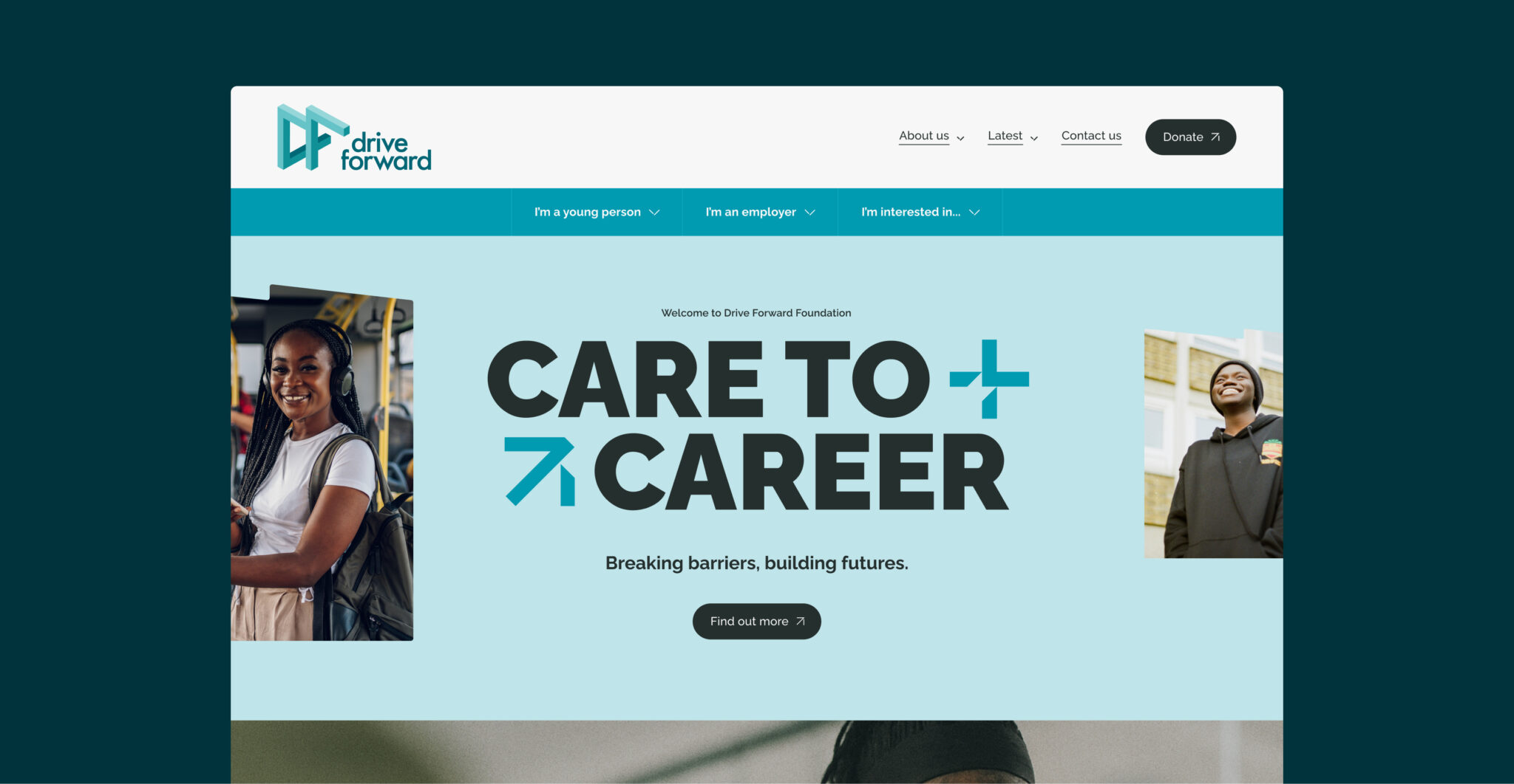
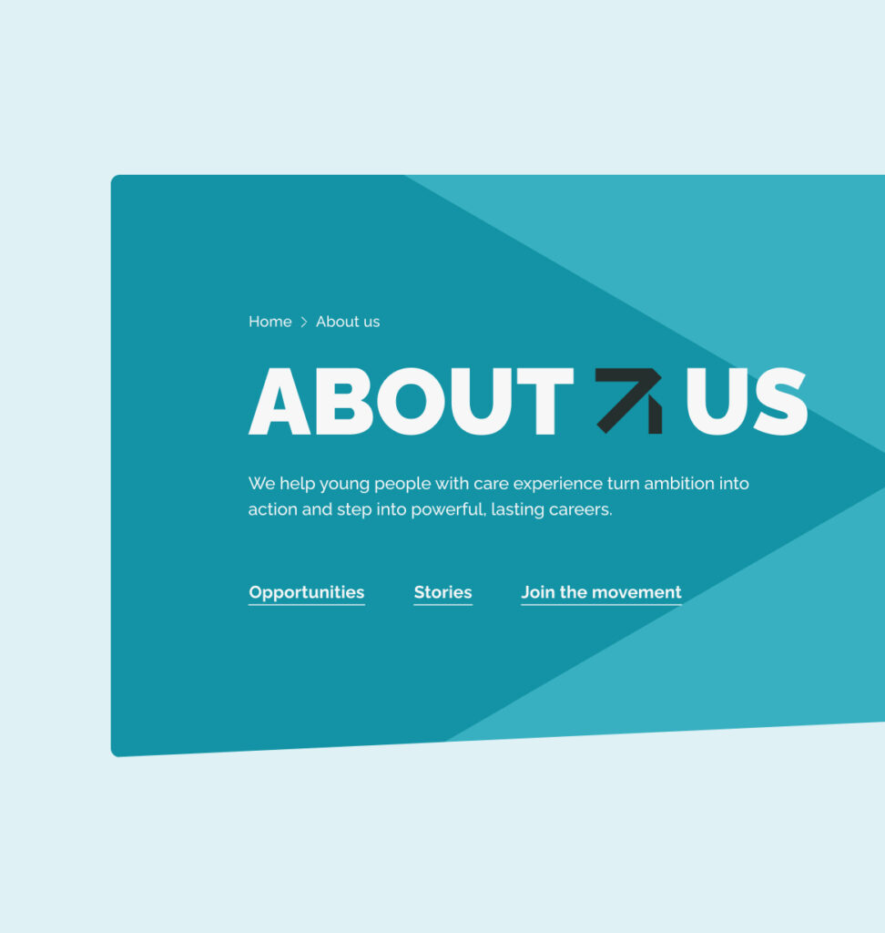
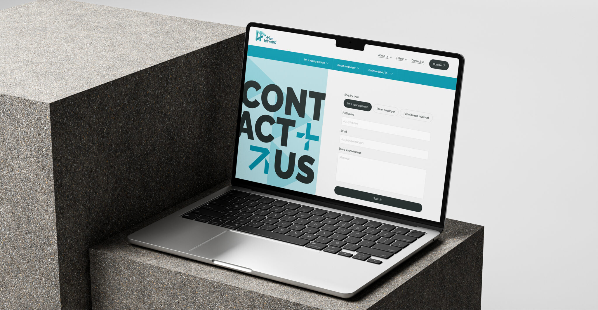
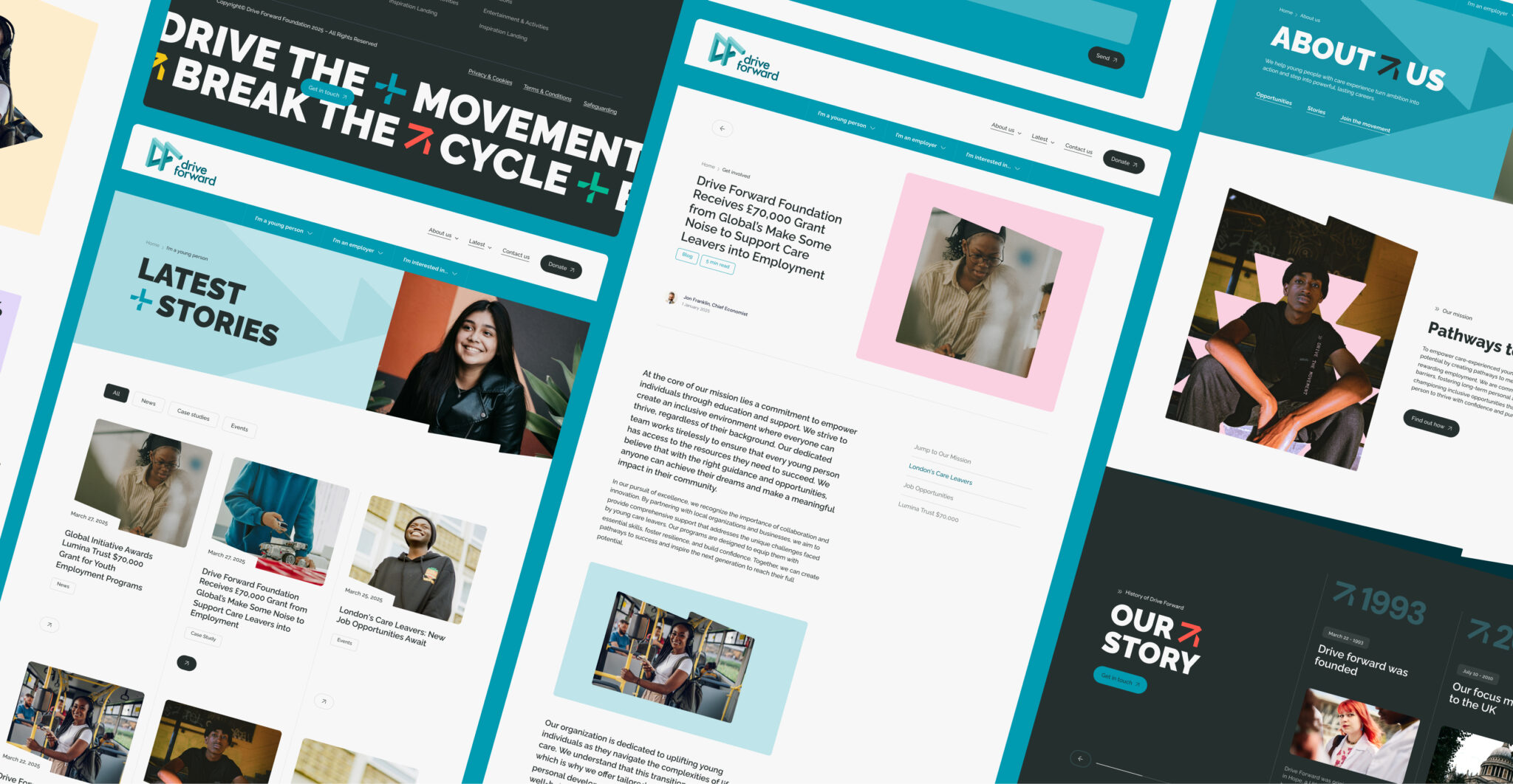
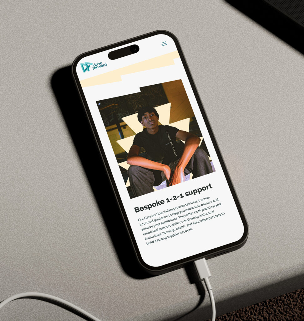
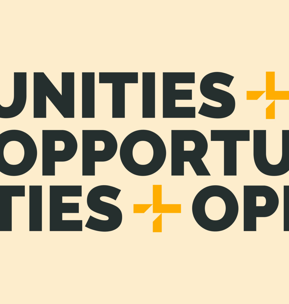
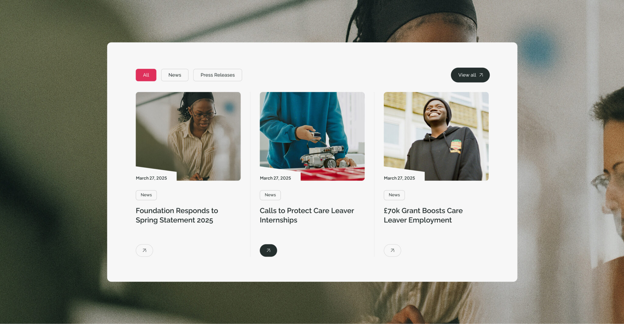
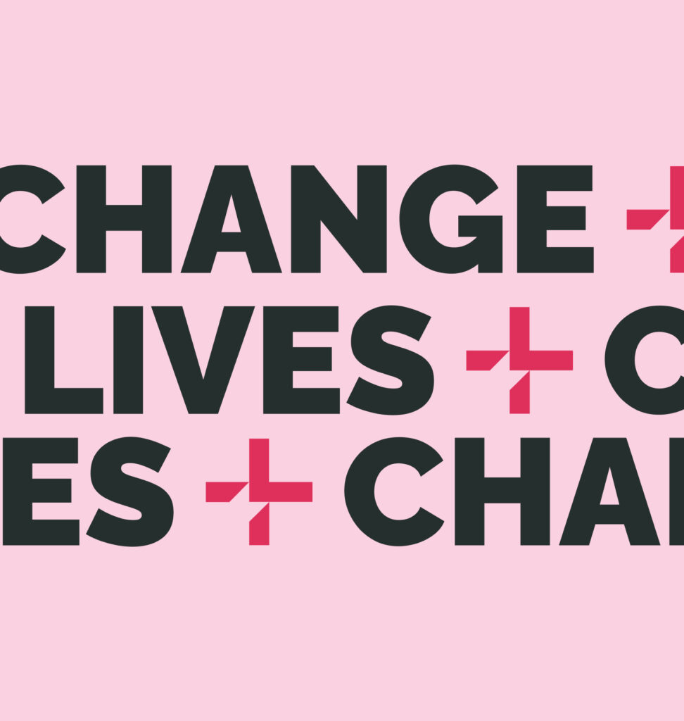
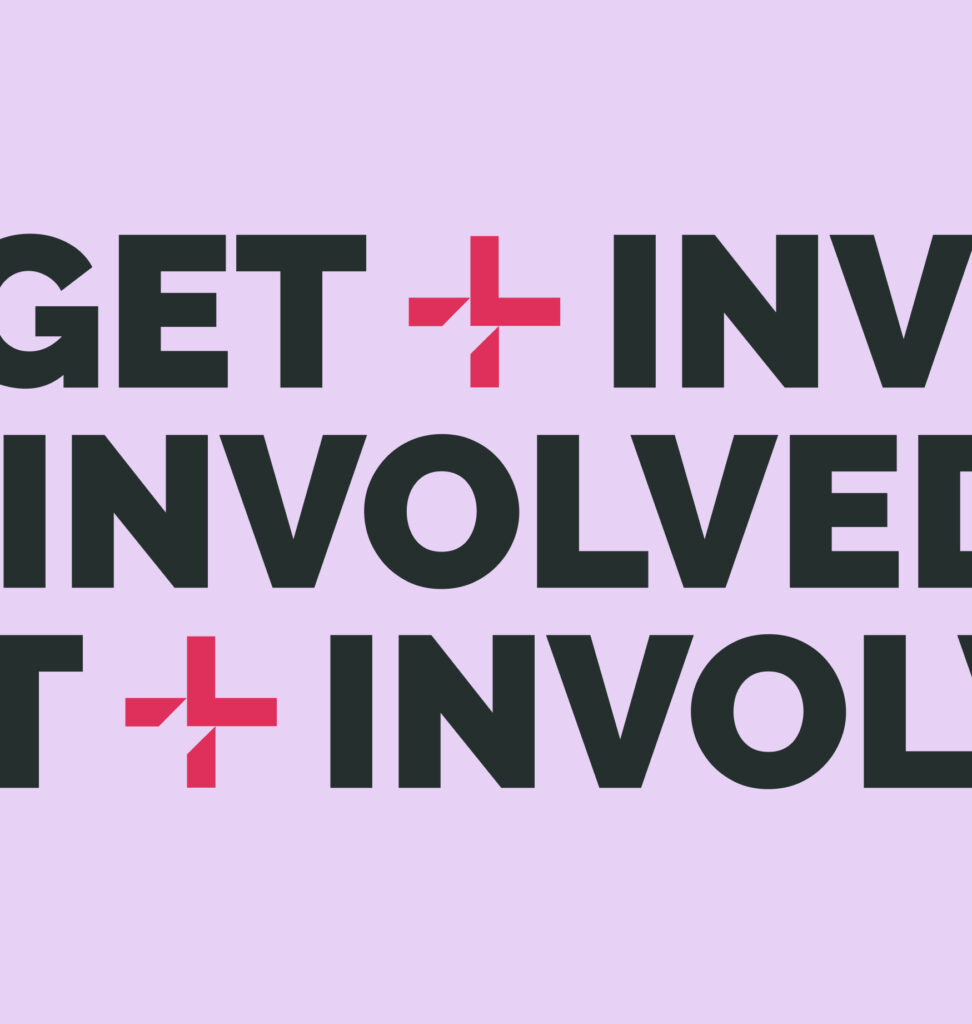
We built a bold, flexible design system for Drive Forward, one that could carry their message with clarity and impact. From expressive typography to dynamic layouts and distinctive shape assets, every element was designed to move with purpose across the site.

Three routes, 
tailored journeys.
Our user research revealed a highly diverse demographic, spanning young people, employers, and community contributors, each with distinct needs and expectations. In response, we redesigned the site architecture around three dedicated navigation routes, giving each audience its own tailored experience. While rooted in a shared brand identity, each pathway features a distinct visual and UI approach, ensuring every user feels the product was built for them.
One site, multiple perspectives
I’m a young person
For the young person section, we concentrated on ensuring content was concise, and navigation points/CTAs were super clear, as our research into the user group told us that they prefer skimming written content, looking for anchors that jump out at them while doing so. As such, we broke down long-form content into easily digestible chunks, used large, attention-grabbing headers, and ensured plenty of eye-catching visuals were used throughout.
I’m an employer
For the employer section, communication was at the heart of every page. Our user group research told us that this audience want as much information as possible, as quickly as possible; so, alongside bold key statements designed to give a concise overview of how employers can get involved with Drive Forward, long-form content is accessible early in the user journey.
Support our mission
The Support our mission section is for everyone who isn’t a young person seeking help, or an employer looking to partner with Drive Forward. It primarily needed to communicate what Drive Forward does, how they do it, and how you can get involved, from fundraising, to mentorships, and even starting a career with Drive Forward. As such, each method of support was clearly defined and signposted, allowing users to find the content they need easily and quickly.

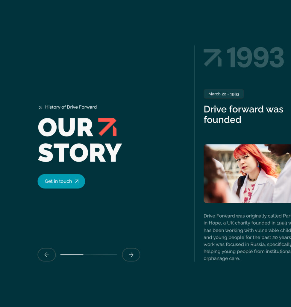
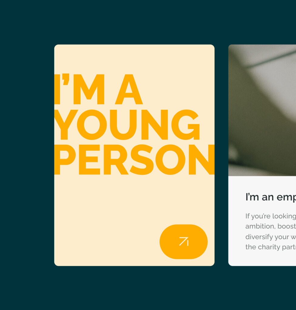
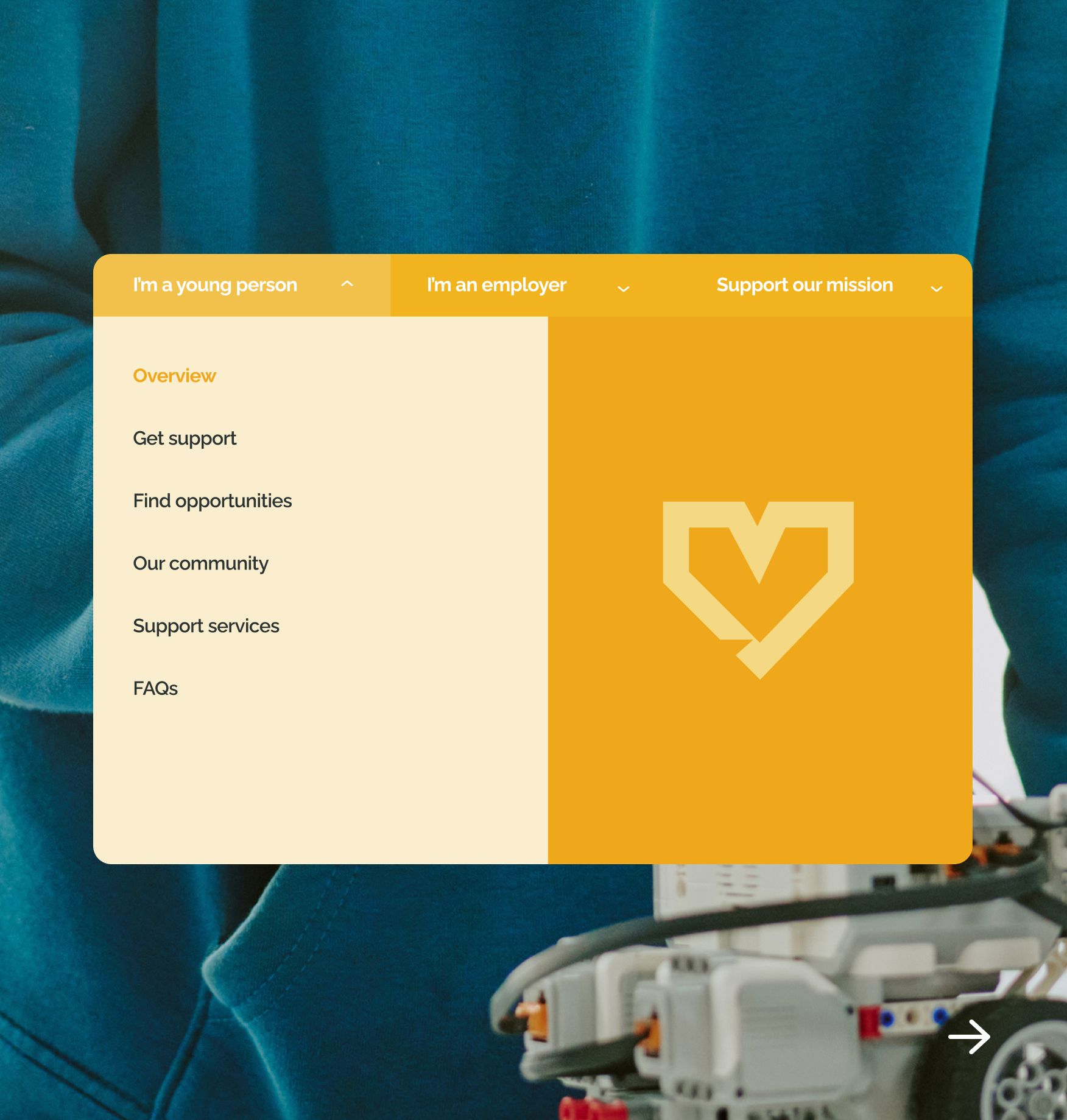
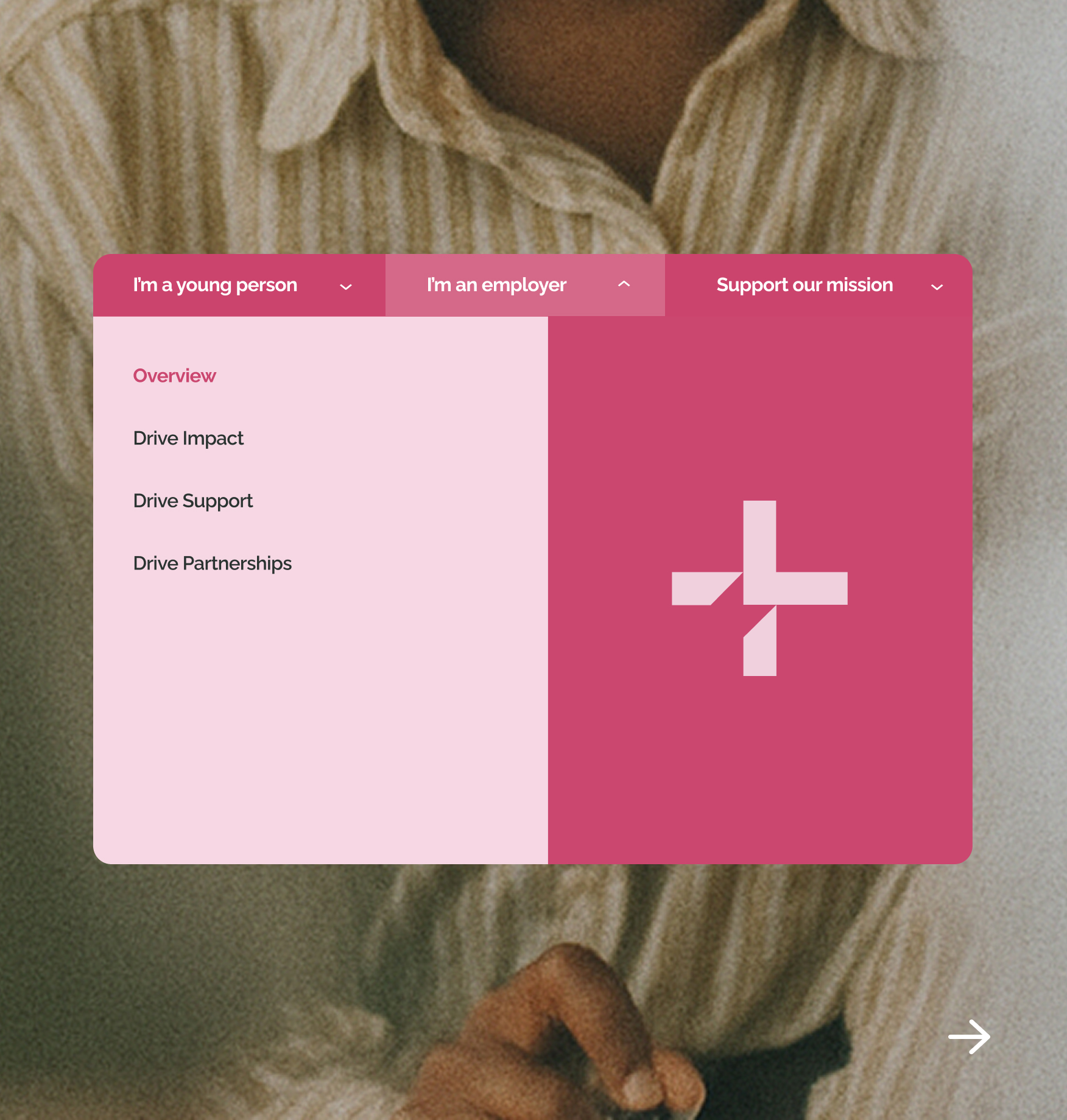
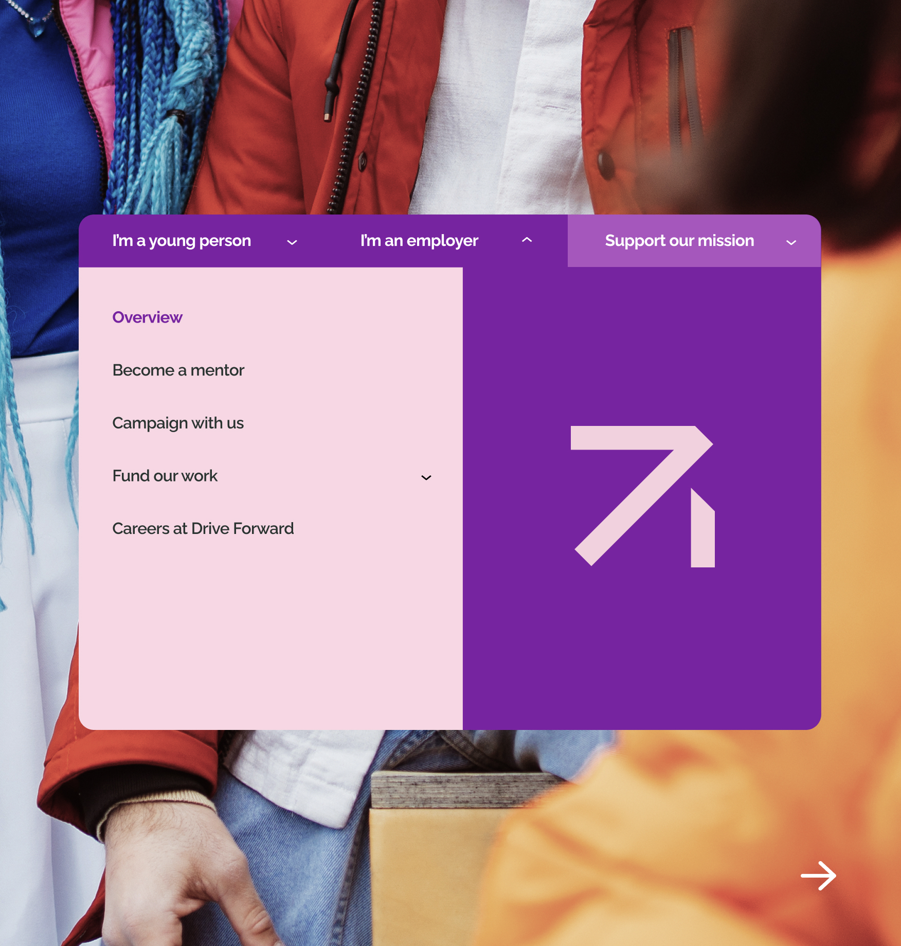
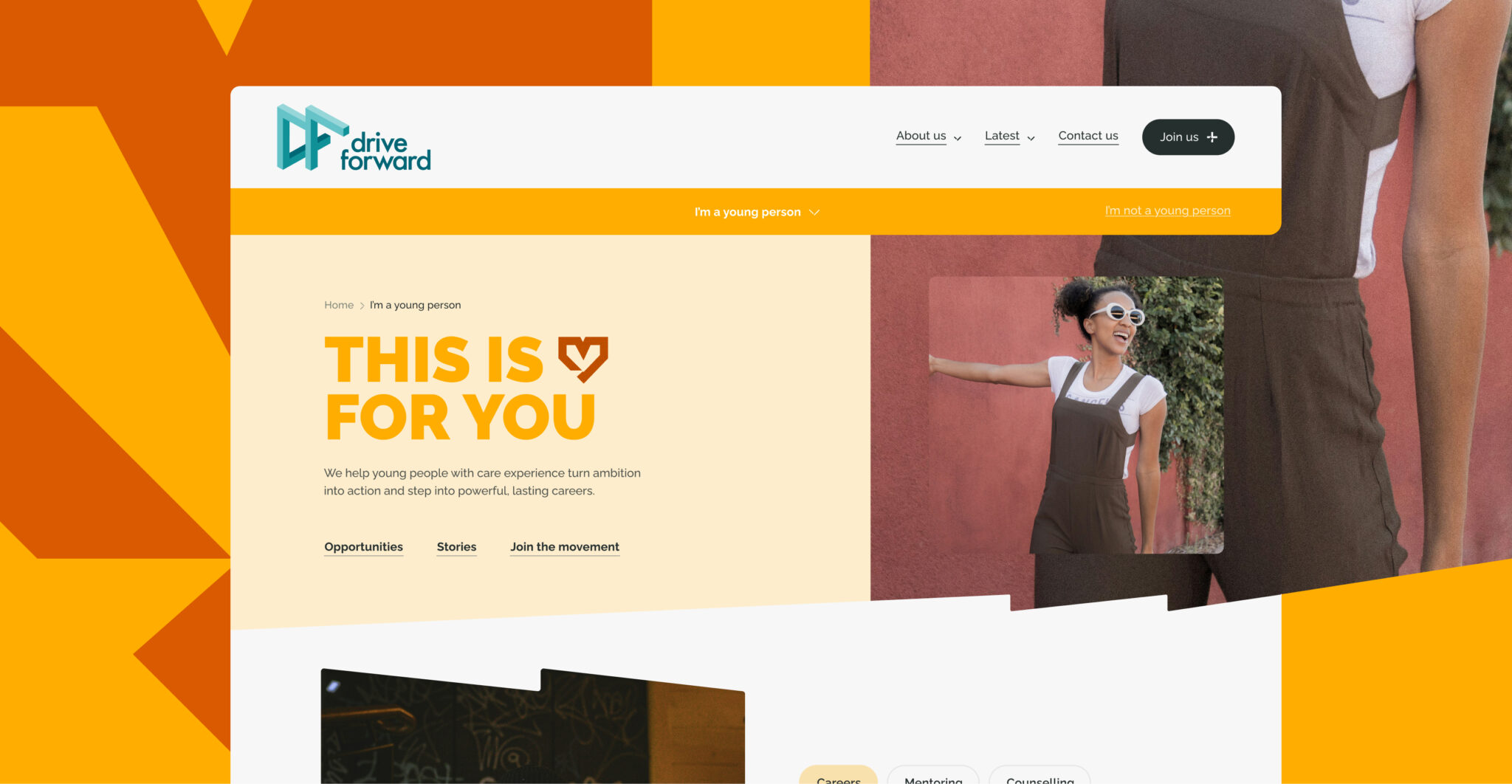
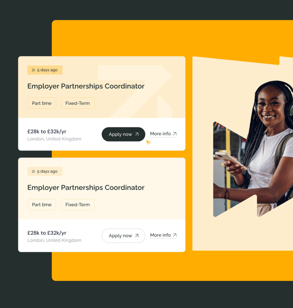
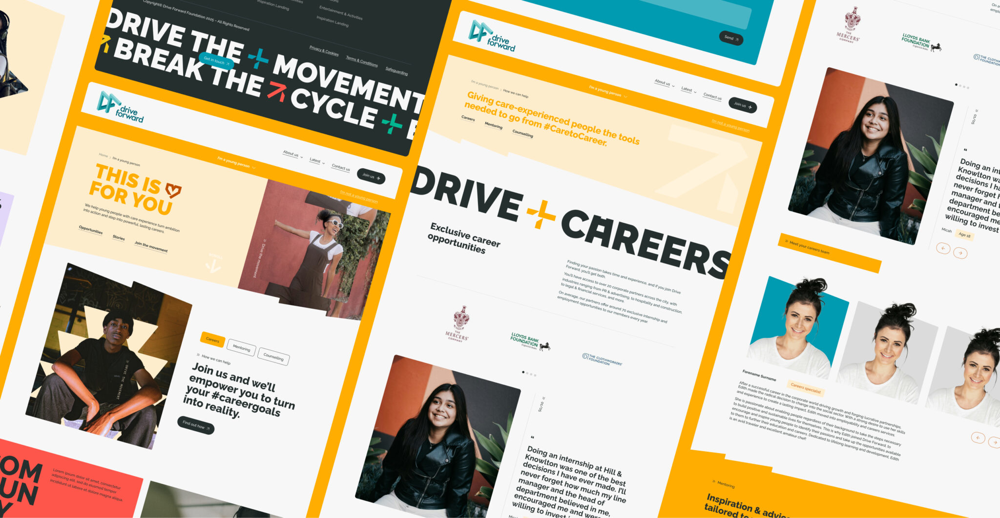
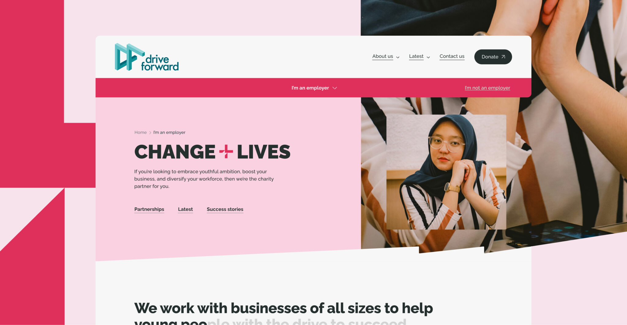
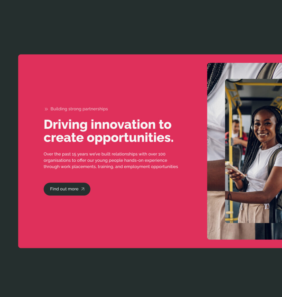
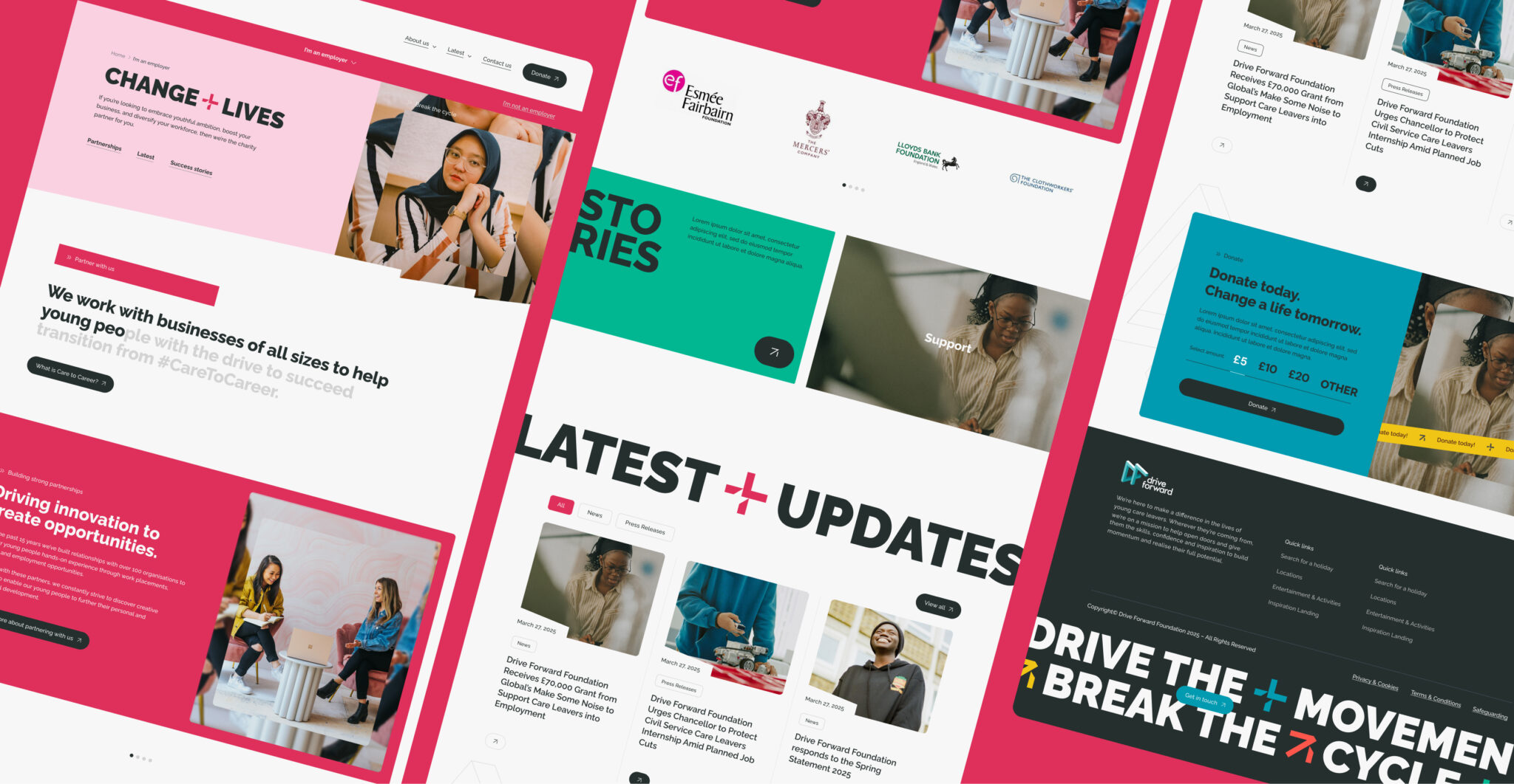
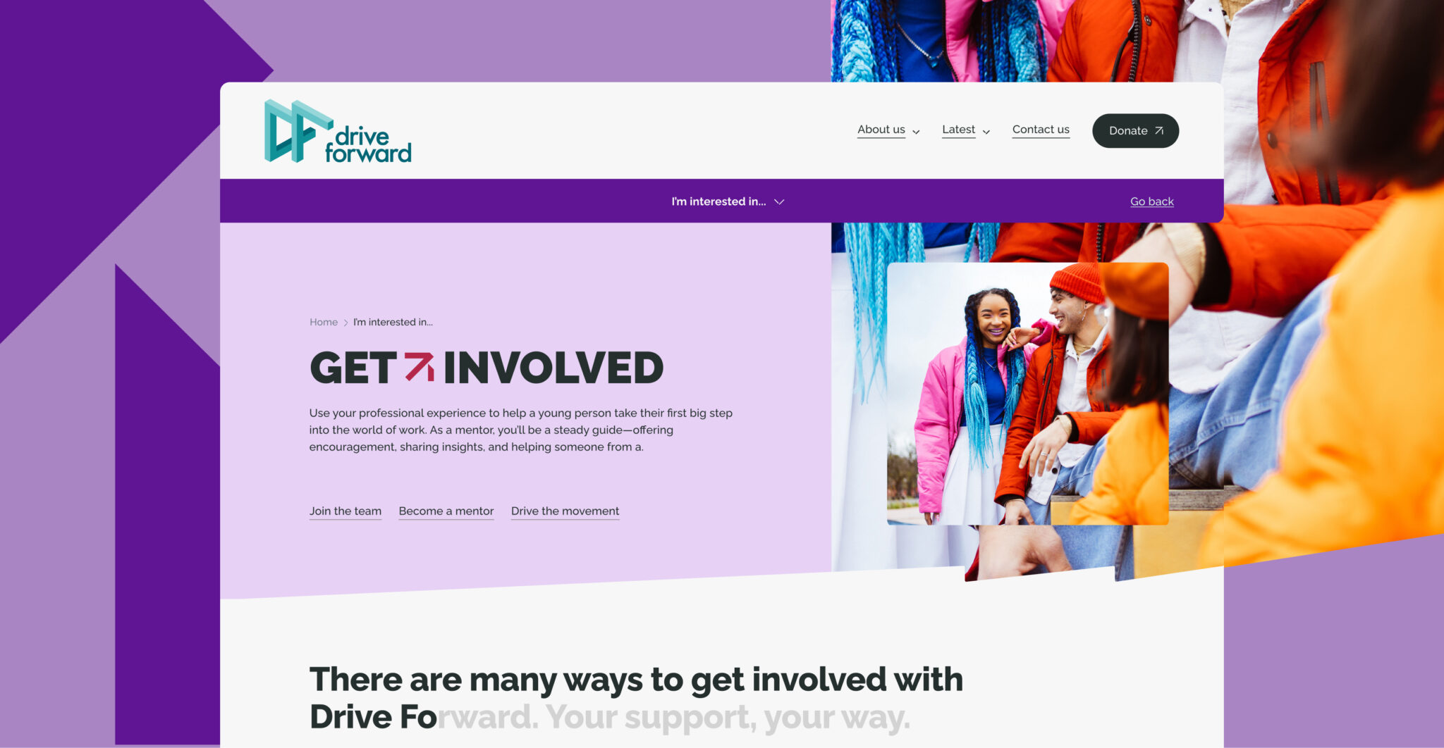
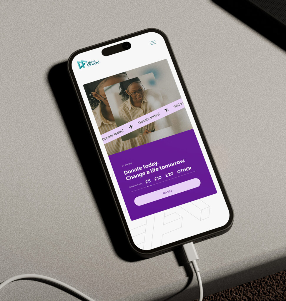
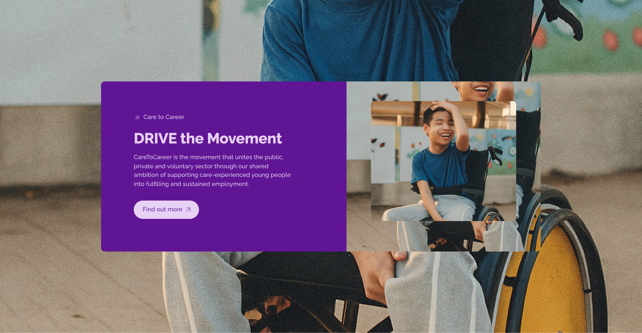
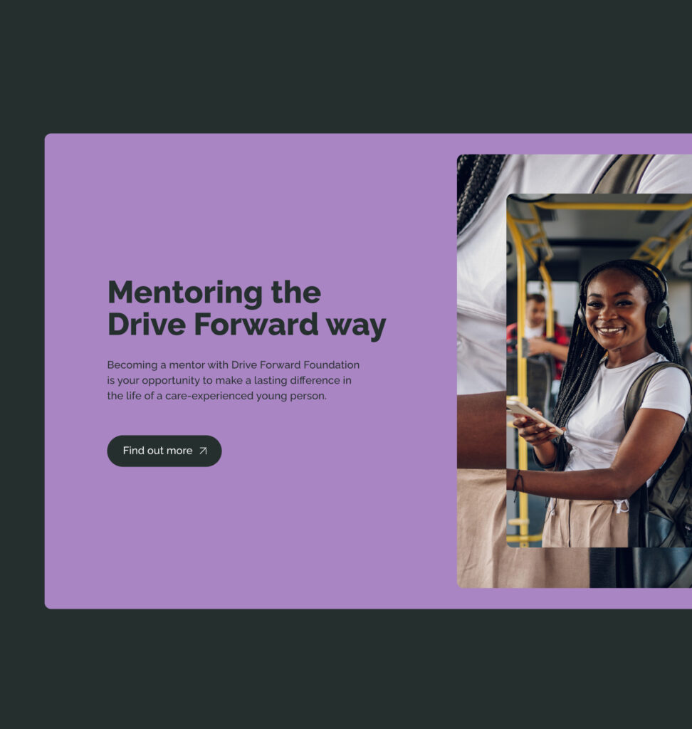
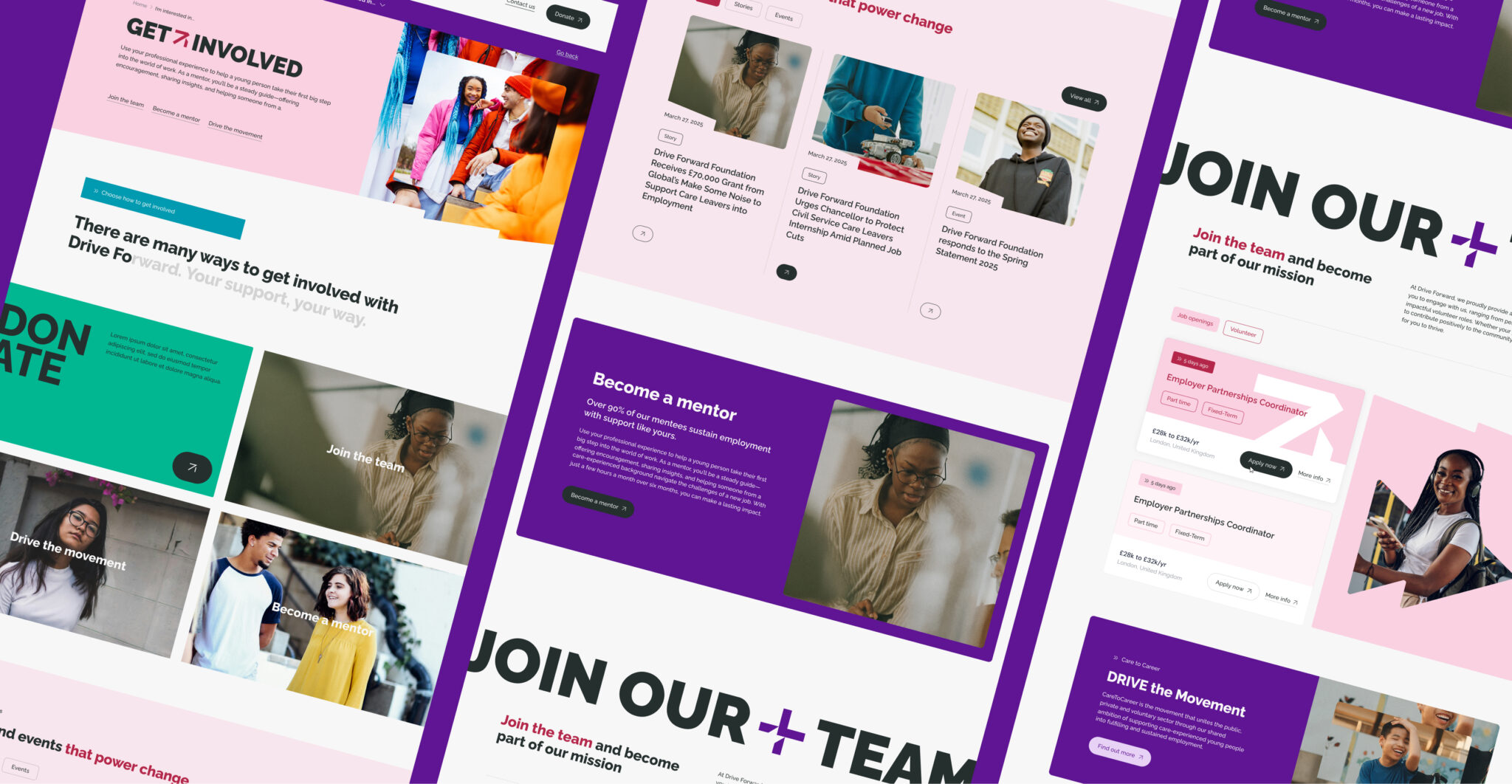
In practice, this turned a complex brief into a set of clear, purpose-built journeys, so every visitor can quickly see where they fit, what is available to them, and how to move forward. It also gives Drive Forward a structure that can grow with new programmes and partners, without losing clarity or making the experience harder to navigate.

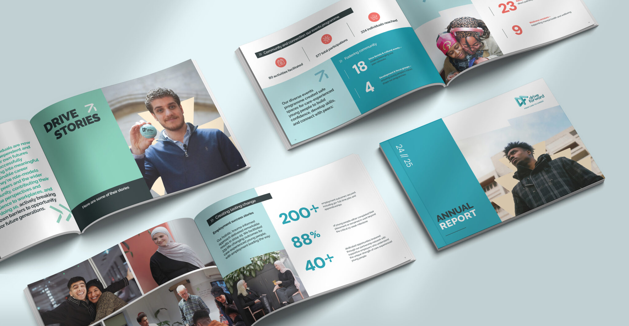
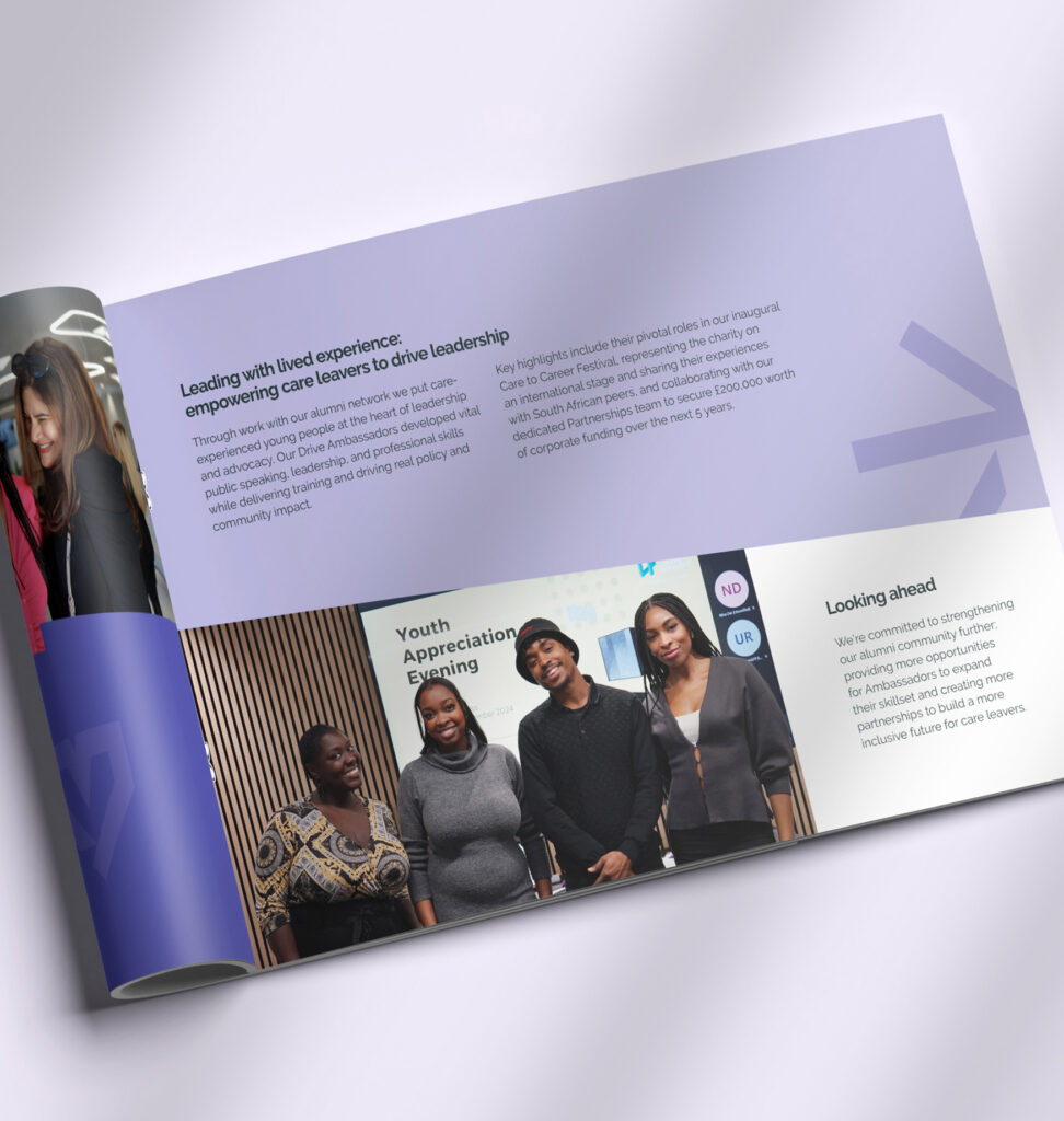
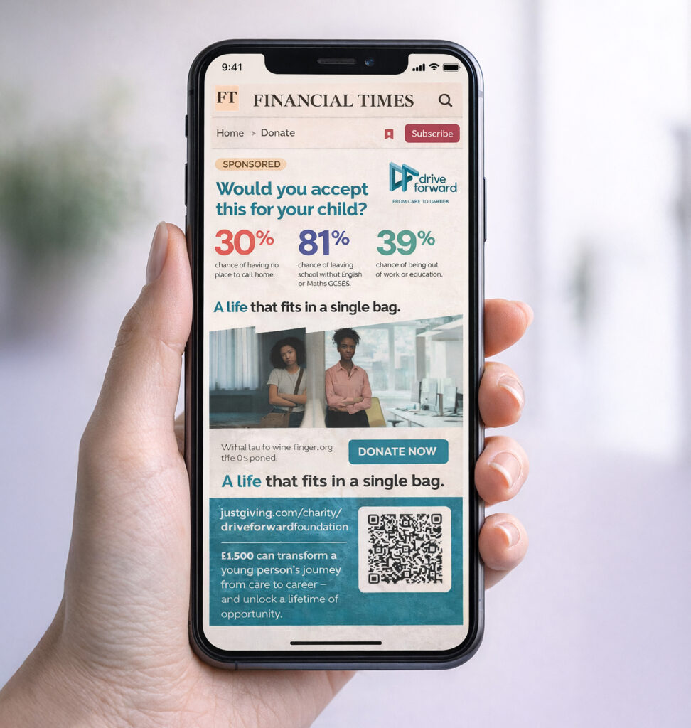
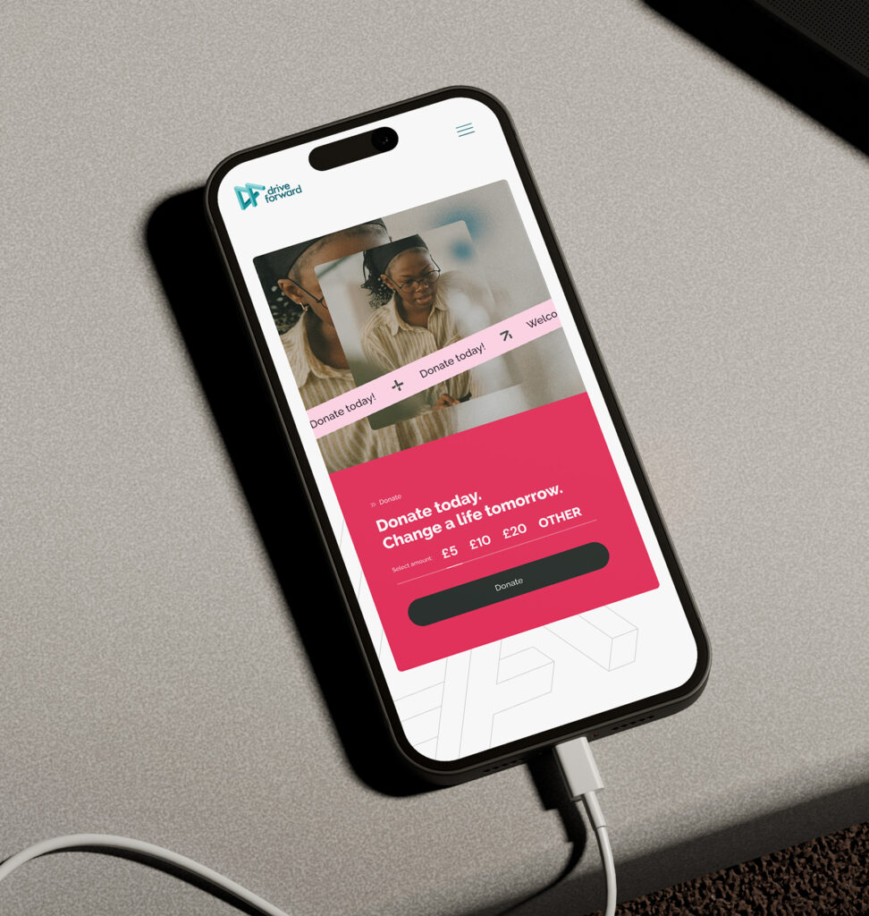
The identity was designed to travel, rolling out across the website, a Financial Times ad, the annual report, and a range of printed merchandise including 
T-shirts and totes. Each piece builds on the same visual language, creating a consistent and recognisable presence in every context.

Let’s work together